The City’s newly launched flag redesign contest has moved on to its second phase. The Flag Design Committee has selected their favorite designs from all of the submitted options. The public will now rank them, via votes. The Committee will then make a decision, based on the amount of votes that each flag receives.
Orlandoans have until April 17, 2017, at midnight, to vote on their favorite flag. You can vote once per day.
Click HERE for more information. We originally wrote about the contest, HERE.
Scroll through the options, below:
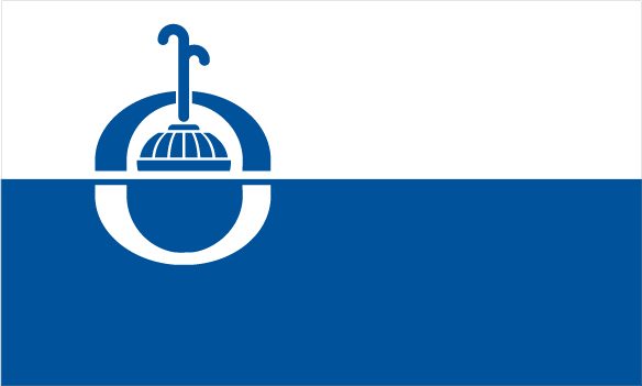
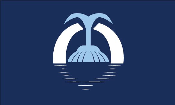
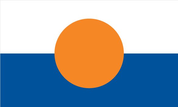
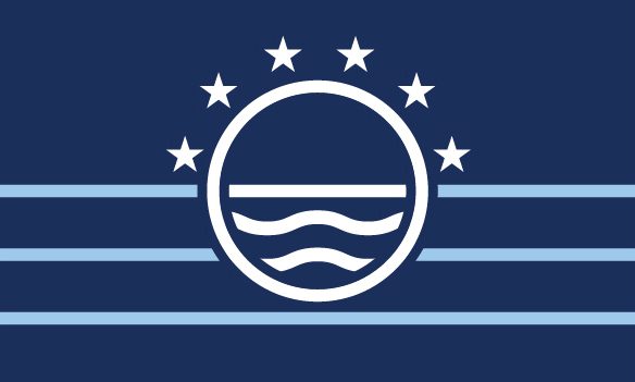
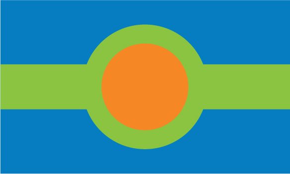
The five golden rays symbolize the sunshine and five arcs of industry for greater Orlando -tourism, arts & culture, professional sports, technology and research. The blue waves symbolize water and activity. The white symbolizes unity. The “O” symbolizes Orlando. VOTE HEREThe city’s logo and Lake Eola fountain symbolize the City of Orlando. The two colors symbolize the purity of the city and the many lakes in the area. The “O” on the flag symbolizes the city’s initial letter. VOTE HEREThe upper arc of the “O” symbolizes both a rainbow and unity. The reflection in the water closes the “O” and closes the circle of unity. The blue of the fountain and the white of the “O” symbolize hopeful images and stand out on the blue flag. VOTE HEREThe water coming from the fountain symbolizes our city’s innovation and outreach. The perfect circle behind the fountain symbolizes the sun rising over our city. The fountain within the open circle symbolizes that we are a city for everyone. The segments represent our six commission districts. The base represents Orlando’s history. VOTE HERELake Eola and the swans that call it home are the heart of the city. The light blue circle represents our many lakes and waterways and the dark blue circle represents our rich culture. VOTE HEREWhite symbolizes peace. Blue symbolizes our numerous lakes and the orange circle in the center of the flag symbolizes Orlando and the fruit we grow in Florida. VOTE HEREThe symbol centered on the flag represents Orlando’s location in Florida. The four pillars symbolize the four seasons and that Orlando is beautiful year-round. The three stars symbolize the attributes of Orlando, cultural diversity, unity, and innovation. The color blue symbolizes stability. The color orange represents attraction, creativity and success. VOTE HEREThe center circle represents the strength of Orlando. Inside the “O” shape, the waves symbolize all of our lakes, waterways, and constant growth. The straight line above the wavy lines highlights our beautiful horizon. Each of the six stars represents one of our districts that surround and make up our city. The outside bottom straight lines form the foundation of our city. The shades of blue symbolize the rich culture in our city. VOTE HEREThe orange circle represents the letter “O” for Orlando, the sun and an orange, due to the rich citrus industry of Orlando. The blue waves symbolize water and the constant/consistent motion moving as one. VOTE HEREThe colors blue and green represent our natural environment. The orange circle represents the sun and citrus industry. The green ring around the orange circle represents our strong community, city infrastructure and is an “O” for Orlando. VOTE HERE
The original flag was so much better than any of these submissions. I don’t see why we should change it. I was born and raised in Orlando and none of these are good enough to represent our city. If this is the best we have we sjould keep the orignal flag.
All are awful. None show the character of the City Beautiful. They are sterile. They all appear to be drawn by only one or two individuals. I cannot vote for any of them. Go back to the drawing board,
The city is just doing this to appease the masses because they’ve modified at least some of the designs for the final round of voting. What’s the point of requesting citizen submissions if they’re only going to steal people’s designs and change them and their descriptions to suit their needs? Also, three fountain designs? Really? THAT’S the most appropriate representation of this city? Lame. Vote for the swan (although the original design was better).
The first link “click here for more information” took me directly to a particular design’s page with my vote recorded for that design (swan). Not sure if the link is bad or it’s a problem on the cities site but you should look into it.


The original flag was so much better than any of these submissions. I don’t see why we should change it. I was born and raised in Orlando and none of these are good enough to represent our city. If this is the best we have we sjould keep the orignal flag.
All are awful. None show the character of the City Beautiful. They are sterile. They all appear to be drawn by only one or two individuals. I cannot vote for any of them. Go back to the drawing board,
The city is just doing this to appease the masses because they’ve modified at least some of the designs for the final round of voting. What’s the point of requesting citizen submissions if they’re only going to steal people’s designs and change them and their descriptions to suit their needs? Also, three fountain designs? Really? THAT’S the most appropriate representation of this city? Lame. Vote for the swan (although the original design was better).
While I appreciate all these efforts, I like the current flag far better than any of the new submissions. Why are we changing the flag?
The first link “click here for more information” took me directly to a particular design’s page with my vote recorded for that design (swan). Not sure if the link is bad or it’s a problem on the cities site but you should look into it.