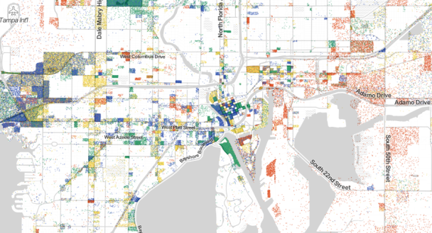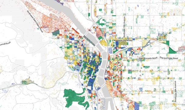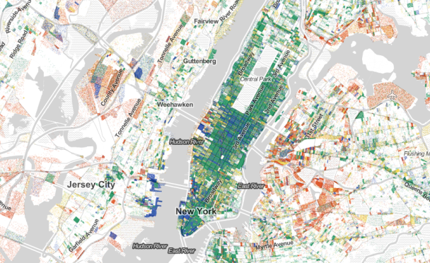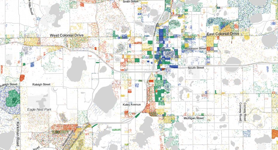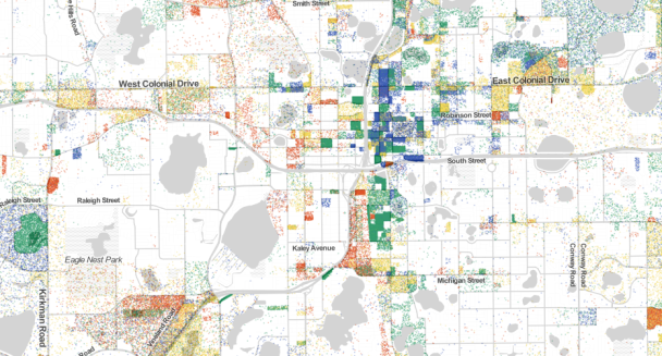
Harvard PhD student Robert Manduca (Website) has created an interactive map that pinpoints jobs throughout the United States based on their type.
- Red is for manufacturing and logistics
- Blue is for professional services
- Green is healthcare, education, and government
- Yellow is retail, hospitality and other services
Manduca used employer-reported data from the U.S. Census in 2010.
To use the map yourself, click HERE.
